
What do colours mean for a website?
In the realm of web design, the use of colour is not merely a matter of aesthetics, but a strategic tool that significantly influences user experience, brand perception, and the overall efficacy of your digital presence. With over 26 years of experience in website design, we understand the profound impact that colour can have on your business.
This blog post aims to delve into the psychology of colours, elucidating their meanings and the ways in which they can be harnessed to align with your business goals, resonate with your target audience, and reflect your unique brand personality. Or put simply 'what are the best colours for websites?'
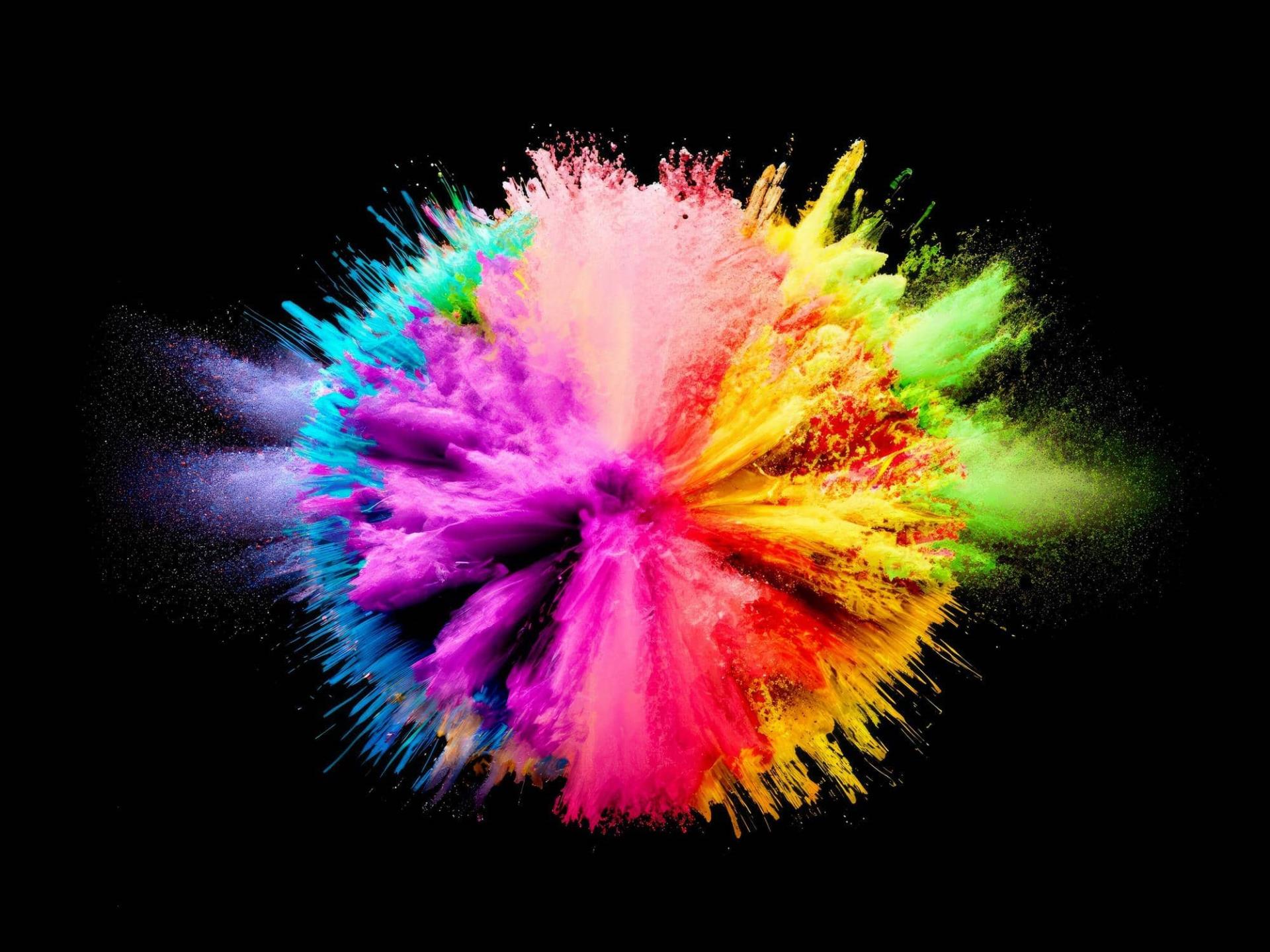
The Psychology of Colours
Red: Passion and Urgency
Red is one of the most powerful colours in the spectrum. It evokes a sense of urgency and passion, making it ideal for calls to action (CTAs) and sales promotions. Research indicates that red can increase heart rates and create a sense of excitement. However, it is crucial to use red sparingly, as excessive use can lead to feelings of anxiety or aggression.
Blue: Trust and Tranquility
Blue is widely regarded as a colour of trust, peace, and reliability. It is no coincidence that many financial institutions and healthcare providers incorporate shades of blue into their branding. Blue can have a calming effect on users, which is particularly beneficial for promoting a sense of security and dependability in your communications.
Green: Growth and Harmony
Green is synonymous with nature, growth, and prosperity. It is often used by brands that wish to emphasise their connection to the environment or their commitment to sustainability. Additionally, green is associated with tranquility and health, making it a suitable choice for wellness and lifestyle brands.
Yellow: Optimism and Attention
Yellow exudes warmth and optimism. It captures attention more immediately than other colours, thus being effective in drawing the viewer's eye to important information or offers. However, too much yellow can be overwhelming and may evoke feelings of frustration or fatigue if not balanced well within your design.
Orange: Enthusiasm and Creativity
Orange combines the energy of red and the happiness of yellow. It is often used to stimulate enthusiasm and creativity. Brands targeting younger demographics or promoting innovative solutions may benefit from the positive and invigorating associations tied to orange.
Purple: Luxury and Wisdom
Purple carries connotations of luxury, wisdom, and sophistication. Historically associated with royalty, it is an excellent choice for brands wishing to portray themselves as prestigious or elite. Purple can also be used to denote creativity and innovation.
Black: Power and Elegance
Black is both powerful and elegant. It is often used in luxury branding due to its association with sophistication and exclusivity. While black can be very striking, it is essential to use it thoughtfully to avoid creating a design that feels too heavy or oppressive.
White: Simplicity and Cleanliness
White symbolises purity, simplicity, and cleanliness. In website design (as well as in other marketing material), white is often used to create a sense of space and ease of navigation. It allows other colours to stand out and is essential for maintaining a balanced and readable user interface.
Implementing Colour Theory in Website Design
We'll help you leverage the psychology of colours to enhance user experience and drive engagement on your website. Here are some key considerations for implementing colour theory in your web design:
Consistency: Ensure that your colour scheme aligns with your brand identity and is consistent across all touchpoints. This reinforces brand recognition and trust.
Balance: Use colours in a balanced manner to avoid overwhelming or confusing users. For instance, while accent colours should stand out, they should not detract from the overall harmony of the design.
Accessibility: Consider colour blindness and other visual impairments by ensuring sufficient contrast between text and background colours. Tools like the WCAG (Web Content Accessibility Guidelines) can help you meet accessibility standards. The WCAG guidelines explain how to make web content more accessible to people with disabilities. Web ‘content’ generally refers to the information in a web page or web app, including:
- natural information such as text, images and sounds
- code or markup that defines structure, presentation, etc.
Cultural Sensitivity: Understand the cultural connotations of colours, as their meanings can vary across different regions and cultures. For example, while white is associated with purity in Western cultures, it may signify mourning in some Eastern cultures.
Is colour important for website design?
In short, yes - colour is important in website design.
With over two decades of experience in the website design industry, we care greatly about helping you create a website that not only looks visually appealing but also resonates profoundly with your audience.
Understanding the meanings and impact of colours can significantly enhance the effectiveness of your digital presence. At aprompt, our approach is rooted in understanding your business goals, values, and audience to create a website that reflects your unique brand and drives success.
Whether you are looking to redesign an existing website or develop a new one, we offer affordable prices, unmatched professionalism and a proven track record in website design and development.
Let us help you create a digital presence that stands out and compels your audience to engage.
For more insights and personalised advice on web design, feel free to ask our expert website designers in Wiltshire. We’re passionate about your success and are always ready to share our expansive knowledge to help you achieve your business objectives.